Product Design
Kachinga
Designing a complex, AI-powered mobile app for a U.S. FinTech startup: from zero to 20,000+ active users.
Overview
Kachinga is a Silicon Valley fintech startup helping families improve financial literacy. As the first designer, I built the complete brand and product from scratch, including a dual-sided app for kids and parents and a physical debit card. The product shipped on iOS and Android and reached 20,000+ active users with strong organic growth.
- Role
- First Designer (0→1)
- Timeline
- 2+ years
- Platform
- iOS & Android
- Result
- 20,000+ active users
The problem
Over 44M families in the US give kids allowances representing $41B, but parents lack the time, knowledge, and confidence to teach their kids to successfully manage money. Only 5 states offer a personal finance class in high school. Kids want empowerment; parents want transparency and control.
The solution
An AI-powered platform to help parents teach and empower their kids to successfully manage money, through a 'smart' app for kids to spend, earn chores, and save, paired with a secure debit card. I created an intuitive and playful experience built on industry-leading financial educational content.
User interviews
I conducted interviews with potential users to validate our assumptions about the problem. The key takeaways affirmed the brief and shaped everything that followed.
User personas
The app had to work for a wide range of users simultaneously: from grandparents to teenagers to CEOs. I created four personas to keep the team aligned on who we were designing for.


Competitive landscape
Kachinga was not the first startup of its kind. We exhaustively analysed rivals and adjacent FinTechs revolutionising banking to understand the design bar we were competing against. The takeaway: none of our competitors solved the entire education problem: they focused on either teaching or applying, not both. Kachinga's unique position was to deliver Learn AND Apply, with personalised AI insights.


Information architecture
I created the IA to outline the app's structure based on the pages and functions to be included: this is the main parent user view, the child's view is less complex but retains most of the same core features.
Sketches
Leading on from the IA, I created lo-fi wireframes on paper to map out pages and their functionalities before moving into digital design.


User flows
The most complex flow was signup; Kachinga has two distinct paths: Virtual Money (a free ledger with no debit card) and Real Money (a real bank account with an optional debit card for children 7+). We structured these flows to be as natural and easy to work through as possible.

Prototyping
I created prototypes of key flows before development to catch issues early. Working on a lean timeline with a dev team around the clock, I would provide spec sheets in real time, and kept the live staging app on my phone via TestFlight to make better decisions on the fly.


User testing
We conducted user testing at almost every stage: smoke testing with team families, Alpha and Beta users, and post-launch feedback through the app's Feedback section and the Kachinga Family Community on Facebook.
Signup testing
The signup flow was critical to test. One common concern: "This feels like a credit check... is it?" We addressed this with clear messaging, reassuring users it was an identity check only and all data was encrypted.


Final UI: Login & Signup


Home: kids & parents view

Earn
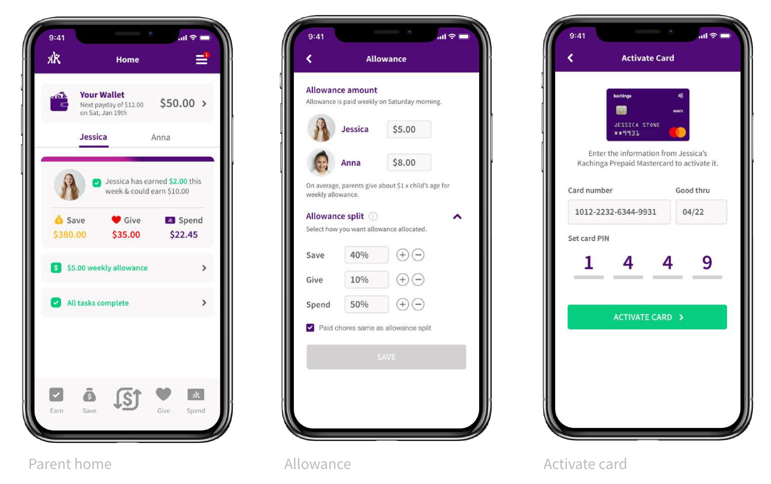
The Earn section covers chores and allowances. A standout design decision was building a full chore scheduling system: no competitor offered fortnightly rotation or multi-child assignment. This became a key differentiator.


Save, Give & Spend


Wallet & Move


Card settings & design
The objective was simple: make the debit card fun and appealing to kids. Designs were centred around the brand colour palette. We explored multiple colourways before settling on one universal design for launch, with plans for customisable designs in the future.


Website
Alongside the app, I designed the marketing website, aimed at parents rather than kids, so the tone shifts to explain the value clearly: how the card and app work together, and why it's a safer way to teach children about money. It carries the same playful brand as the product itself, so the site feels like a natural extension of the app rather than a separate corporate layer.
Post-launch reception
Since launching on the App Store and Google Play, Kachinga has received very positive feedback from real users. The app reached 20,000+ active users with strong organic growth.
Active users on iOS & Android
As sole designer, zero to shipped
Brand, UX, UI, card: all from scratch
Design iterations on the home screen alone